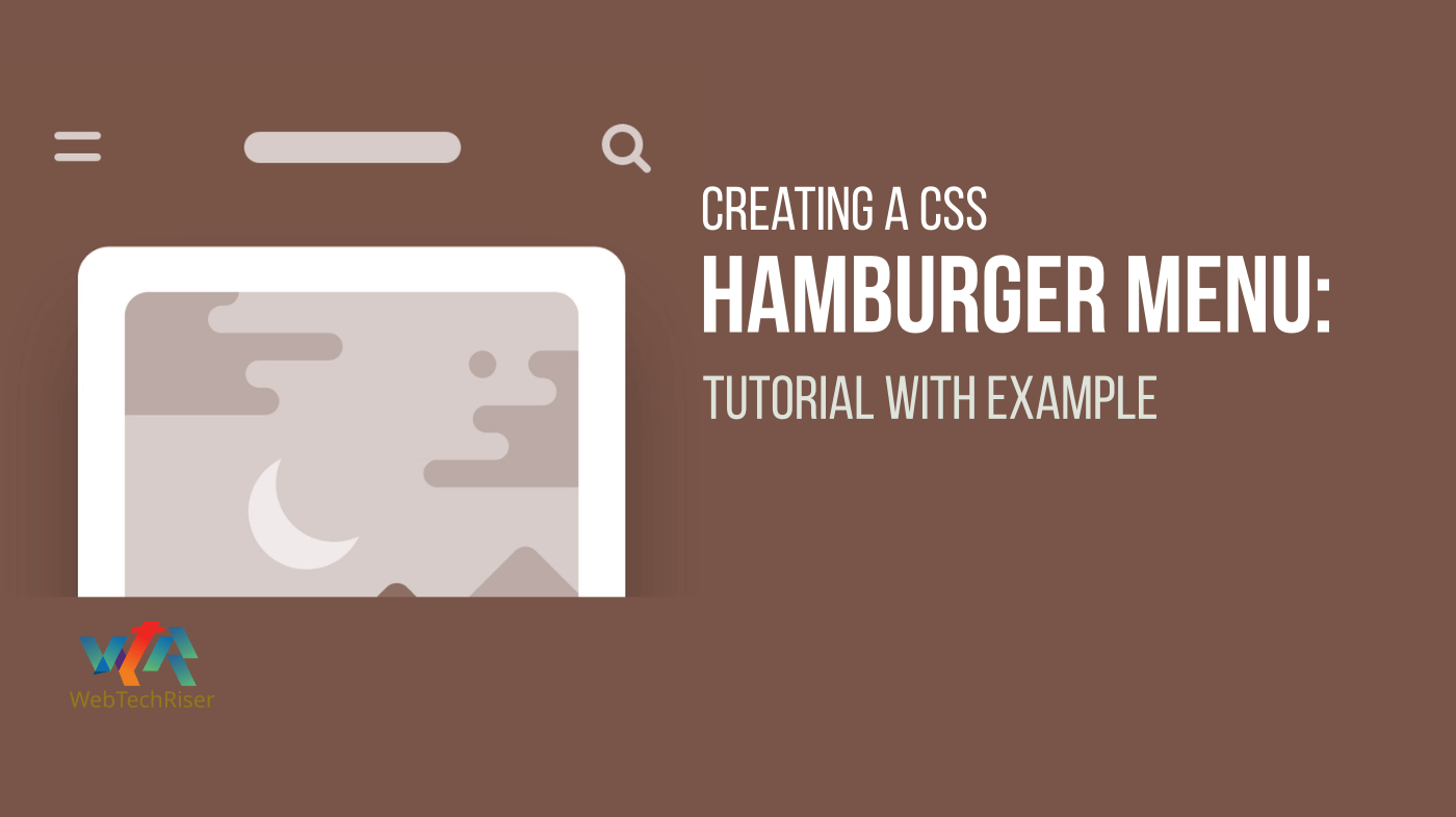
As a web designer or developer, you must have come across the Hamburger Menu, also known as the sandwich menu or the three-bar menu. This is an iconic and widely used UI element that is used to show an alternative menu and navigation options on mobile devices.
In this tutorial, we take a look at what a hamburger menu is, its history, benefits, drawbacks, and how to create it using HTML, CSS, and JavaScript.
We will also take a look at how to create a hamburger menu on a WordPress website, and how to use website-building tools to create one if you are not familiar with HTML and CSS.
What is a Hamburger Menu?

A hamburger menu is an icon consisting of three stacked horizontal bars (or what can be seen as a bun with two layers of the patty) that is used to display a menu list. It is a common UI element on mobile devices and is widely used as an alternative navigation menu on desktop websites.
The hamburger menu icon is usually placed at the top left or top right corner of the website or app, and when clicked, it will display the alternative navigation menu.
The hamburger menu icon is a great way to reduce clutter on the website, as it can collapse an entire navigation menu into a single icon. It can also help users to navigate the website or app more quickly as they can access the menu with a single click.
Benefits and Drawbacks of the Hamburger Menu
The hamburger menu is one of the most widely used UI elements on mobile devices and desktop websites, and it has some advantages and disadvantages.
Advantages of the Hamburger Menu
One of the main benefits of using a hamburger menu is that it can reduce the clutter on the website, as the menu items can be moved into the hamburger menu icon. This can also help to improve the user experience, as users can access the menu quickly with a single click.
Another advantage of the hamburger menu is that it is a simple and easily recognizable UI element. Users can quickly recognize it and use it to access the menu.
Disadvantages of the Hamburger Menu
On the other hand, one of the main drawbacks of the hamburger menu is that it can be difficult to use for users who are not familiar with it. This is because the icon is not intuitive and users might not be able to recognize it or know how to use it.
In addition, the hamburger menu can also hide the navigation menu from the users, which can make it difficult for them to find what they are looking for. This can lead to a poor user experience, and users might end up leaving the website or app.
History of Hamburger Menu
The hamburger menu icon was first designed by Norm Cox in 1981 for a Xerox Star operating system. The icon was initially used as a way to show the user a list of options, and it was later adopted by Microsoft in the 1990s.
Since then, the hamburger menu icon has become an iconic UI element and is widely used across the web and mobile apps. It has become a popular element for mobile devices, and it is increasingly used on desktop websites as an alternative navigation menu.
How to Create a Hamburger Menu
Creating a hamburger menu on a website or app is relatively easy, and all it takes is some basic knowledge of HTML, CSS, and JavaScript.
The first step is to create the HTML for the hamburger menu. This can be done by creating a <div> element with a unique id and then adding a button element with an onClick event. This button element will be used to toggle the visibility of the menu when clicked.
Next, you will need to create the CSS for the hamburger menu. This is where you can style the hamburger menu to make it look more appealing. You can change the background color, width, and height of the hamburger menu. You can also add a transition effect when the menu is toggled.
Finally, you will need to add some JavaScript to the hamburger menu. This is where you can add functionality to the hamburger menu, such as toggling the visibility of the menu when the button is clicked.
Hamburger Menu on a Website
The hamburger menu can be used on a website to reduce clutter and improve the user experience. It can be used to hide the navigation menu and make it easier for users to access the menu with a single click.
When creating a hamburger menu for a website, it is important to make sure that the menu is responsive and works on all devices. This means that the menu should be visible on both desktop and mobile devices, and it should be easy to use on both devices.
In addition, it is also important to make sure that the menu is accessible to all users. This means that the menu should be easy to use for users with disabilities, and it should also be easy to find and use for users who are not familiar with it.
Hamburger Menu HTML Markup
<header>
	<nav>
        <input type="checkbox" name="toggle-nav">
			<label for="toggle-nav">
				<span class="menu-icon"></span>
			</label>
			<section class="side-nav-panel">
                <section class="nav-profile">
                    <img src="https://assets.codepen.io/1526798/internal/avatars/users/default.png?fit=crop&format=auto&height=80&version=1638251886&width=80" alt="">
                    <section class="profile-info">
                        <h2>Leif Daniels</h2>
                        <p>Application developer with too many hobbies.</p>
                    </section>
                </section>
				<ul class="top-nav">
                    <li><a href="">Home</a></li>
					<li class="parent-item"><a href="#">About</a>
						<ul class="submenu">
							<li><a href="#">Leif</a></li>
							<li><a href="https://www.freecodecamp.org/" target="_blank">Coding</a></li>
						</ul>
					</li>
					<li class="parent-item"><a href="#">Projects</a>
						<ul class="submenu">
							<li><a href="#">Websites</a></li>
							<li><a href="#">Apps</a></li>
							<li><a href="#">Toolkits</a></li>
						</ul>
					</li>
					<li><a href="#">Contact</a></li>
				</ul>
                <section class="social-nav social-nav__aside">
                    <a href="#"><i class="fab fa-codepen"></i></a>
                    <a href="#"><i class="fab fa-github"></i></a>
                    <a href="#"><i class="fab fa-linkedin"></i></a>
                    <a href="#"><i class="far fa-envelope"></i></a>

                </section>

				<!-- 		DarkModeJS Toggle Button		 -->
				<button class="dark-mode-button" aria-label="dark mode toggle">
					<span aria-hidden="true" class="dark-toggle">
							<span class="DTspan"></span>
					</span>
				</button>

			</section>
	</nav>
	<a href="#" class="header-logo"><img src="" alt="Logo"></a>
	<section class="social-nav social-nav__header">
        <a href="#"><i class="fab fa-codepen"></i></a>
        <a href="#"><i class="fab fa-github"></i></a>
        <a href="#"><i class="fab fa-linkedin"></i></a>
        <a href="#"><i class="far fa-envelope"></i></a>
     </section>
</header>
<main>
</main>
Source: https://codepen.io/JBranski/pen/rNzXmYa
Hamburger Menu CSS (SCSS) Styling
// VARIABLES
// base colors
$white: #fcfcfc;
$black: #3c3c3c;

// accent colors
$yellow: #ffb703;
$orange: #fb8500;

// light mode colors
$dark-blue: #023047;
$light-blue: #219ebc;

// dark mode colors
$dm-black: #07080a;
$dm-off-black: #0a0b0d;
$dm-dark-gray: #16181a;

* {
	margin: 0;
	padding: 0;
	box-sizing: border-box;
}

body {
	font-family: sans-serif;
}

header {
	display: flex;
	flex-direction: row;
	align-items: center;
	justify-content: space-between;
	height: 75px;
	padding: 0 24px;
	background-color: $light-blue;
	color: #fefefe;

    // keeps the menu items evenly split
    > * {
        width: 33.3vw;
    }

    .header-logo {
        text-align: center;
    }
}

nav {
	position: relative;

	// aligning the menu button with the hidden checkbox
	input[name="toggle-nav"],
	label[for="toggle-nav"] {
		position: absolute;
		top: -20px;
		width: 35px;
		height: 35px;
	}

	input[name="toggle-nav"] {
		display: block;
		cursor: pointer;
		opacity: 0;
		z-index: 1091;

        &:hover:checked + label[for="toggle-nav"],
        &:active:checked + label[for="toggle-nav"],
        &:focus:checked + label[for="toggle-nav"] {
            .menu-icon::before,
            .menu-icon::after {
                background-color: $orange;
            }
        }
	}

	label[for="toggle-nav"] {
		display: flex;
		flex-direction: column;
		justify-content: center;
		align-items: center;
		z-index: 1090;

		// creating the menu button
		.menu-icon {
			display: block;
			width: 100%;
			height: 3px;
			border-radius: 10px;
			background-color: $white;
			transition: all .5s ease;

			&::before,
			&::after {
				position: absolute;
				@extend .menu-icon;
				content: '';
			}

			&::before {
				top: 7px;
			}

			&::after {
				bottom: 7px;
			}
		}
	}

	input[name="toggle-nav"]:checked {
		& ~ .side-nav-panel {
			left: 0;
		}

		& + label[for="toggle-nav"] {
			.menu-icon {
				// makes the middle bar disappear to help create the X
				background-color: transparent;

				&::before,
				&::after {
					background-color: $white;
				}

				// rotates and positions the top and bottom bar to create the X
				&::before {
					top: 16px;
					transform: rotate(45deg);
				}

				&::after {
					bottom: 16px;
					transform: rotate(-45deg);
				}
			}
		}
	}

	.side-nav-panel {
		display: flex;
		flex-direction: column;
		position: fixed;
		top: 0;
		left: -100vw;
		width: 90vw;
		max-width: 380px;
		height: 100vh;
        padding-top: 85px;
		background-color: $dark-blue;
        box-shadow: 1px 0 5px rgba($dm-dark-gray, .5),
                    1px 0 3px rgba($dm-black, .7);
		transition: 0.5s left;
	}

	.top-nav {
        max-height: 50vh;
        overflow-y: auto;

        @media ( max-height: 540px ) {
            max-height: 30vh;
        }

		// link styling for entire nav menu
		a:link,
		a:visited {
			color: $white;
			text-decoration: none;
		}

		// invert colors when menu is open
		.active a:link,
		.active a:visited {
			color: $black;
		}

		a:hover,
		a:active,
		a:focus {
			text-decoration: underline;
		}

		> li {
			min-height: 50px;
			max-height: 100vh;
			width: 95%;
			border-top-right-radius: 10px;
			border-bottom-right-radius: 10px;
			letter-spacing: 1px;
			cursor: pointer;

			// keep the background white on hover or when a submenu is open
			&:hover,
			&:active,
			&:focus,
			&.active{
				background-color: $white;

				a:link,
				a:visited {
					color: $black;
				}
			}

		    a {
				display: block;
				width: 100%;
                height: 100%;
				padding-left: 2em;
			}

            > a {
                padding-top: 15px;
            }
		}
	}

	.parent-item {
		position: relative;

		> a::after {
			content: '^';
			display: inline-block;
			position: relative;
			top: 2px;
			left: 4px;
			font-size: 1em;
			transform: rotate(90deg);
			transition: all .3s;
		}

		// rotates the icon to show submenu being open
		&.active > a::after {
			top: -2px;
			transform: rotate(180deg);
		}
	}

	.submenu {
		background-color: #e8e8e8;
		position: relative;
		top: 12px;
		left: 0;
		max-height: 0;
		opacity: 0;
		visibility: hidden;
		overflow: hidden;
		// lets the submenu fill in nicely with the parent element
		border-bottom-right-radius: 10px;
		// using max-height allows for better transitioning over just height
		transition:	opacity .3s ease-in-out,
								visibility .3s ease-in-out,
								max-height .2s ease-in-out,
								margin-bottom .3s ease-in-out;

		&.active {
			opacity: 1;
			visibility: visible;
			max-height: 100vh;
			margin-bottom: 8px;
			transition: max-height 1s;
		}

		li {
			position: relative;
			padding-left: 1em;
			background-color: $white;

			// add icon before all submenu items for better clarity
			&::before {
				content: '▸';
				display: block;
				position: absolute;
				top: 10px;
				left: 32px;
				color: #000;
			}

            a {
                padding-top: 12px;
                padding-bottom: 12px;
            }
		}
	}

//     NAV PROFILE CSS

    .nav-profile {
        display: flex;
        flex-direction: row;
        justify-content: flex-start;
        align-items: center;
        width: 80%;
        margin: 0 auto 2em;

        img {
            width: 100px;
            height: 100px;
            border-radius: 10%;
            object-fit: fill;
            margin-right: 12px;
        }

        .profile-info {
            display: flex;
            flex-direction: column;
            justify-content: flex-end;
            height: 100%;
            max-height: 100px;
            width: 200px;

            p {
                margin-top: 4px;
            }
        }
    }
}

// social nav
.social-nav {
    &__header {
        display: flex;
        justify-content: flex-end;
        flex-wrap: wrap;
    }

    &__aside {
        width: 80%;
        text-align: center;
        position: absolute;
        bottom: 2em;
        left: 0;
        right: 0;
        margin: 0 auto;
        padding-top: 2em;
        border-top: 2px solid $white;
    }

    .fab,
    .far{
        font-size: 1.375em;
        color: $white;
        margin: 0 6px;
    }
}


// Dark Mode toggle btn styles
.dark-mode-button {
	display: block;
	position: absolute;
	top: 20px;
	right: 36px;
    background: transparent;
    border: none;
    height: 40px;
    display: flex;
    flex-direction: column;
    justify-content: center;
    align-items: center;
    transition: .3s ease-in;
	letter-spacing: 1px;
}

.dark-mode-button:before {
    content: 'THEME';
    position: relative;
    color: #fff;
    left: 2px;
    bottom: 8px;
    transition: .1s ease-in;
}

body.dark-mode .dark-mode-button:before {
    color: #fff;
}

.dark-toggle {
    margin: 0;
    width: 30px;
    height: 16px;
    z-index: 20;
    border-radius: 10px;
    background: transparent;
    display: flex;
    align-items: center;
    transition: .3s ease;
    display: flex;
    justify-content: center;
    z-index: 1000;
    display: flex;
    flex-direction: row;
    align-items: center;
}

body.dark-mode .dark-toggle {
    background: $dark-blue;
    border: none;
}

.dark-toggle span {
    height: 20px;
    width: 20px;
    left: -18px;
    border-radius: 50%;
    background: #fff;
    position: relative;
    transition: .3s ease;
    box-shadow: 0px 0px 5px 0px rgba(0,0,0,0.75);
}

body.dark-mode .dark-toggle span {
    left: 20px;
    transition: .3s ease;
}

.dark-mode-button .dark-toggle {
    background: $yellow;
    width: 40px;
}


// Dark Mode Styles

body.dark-mode {
    background-color: $dm-off-black;
    color: $white;

    header {
        background-color: $dm-dark-gray;

        a {
            color: $white;
        }
    }

    nav .side-nav-panel {
        background-color: $dm-black;
        box-shadow: 1px 0 5px rgba($white, .1),
                    1px 0 3px rgba($white, .2);
    }

    input[name="toggle-nav"]:hover:checked + label[for="toggle-nav"],
    input[name="toggle-nav"]:active:checked + label[for="toggle-nav"],
    input[name="toggle-nav"]:focus:checked + label[for="toggle-nav"] {
        .menu-icon::before,
        .menu-icon::after {
            background-color: $light-blue;
        }
    }

    .top-nav {
        .active a:link,
        .active a:visited {
            color: $white;
        }

        & > li:hover,
        & > li:active,
        & > li:focus,
        & > li.active {
            color: $white;
            background-color: $dark-blue;

            a:link,
            a:visited {
                color: $white;
            }
        }
    }

    .submenu {
        background-color: $dark-blue;

        li {
            background-color: $dark-blue;
        }

        li::before {
            color: $white;
        }
    }
}
Source: https://codepen.io/JBranski/pen/rNzXmYa
Hamburger Menu JavaScript
// START DarkModeJS
const body = document.querySelector('body');

// Dark Mode Action
let darkMode = localStorage.getItem("darkMode");
const darkModeToggle = document.querySelector('.dark-mode-button');

// Enable Dark Mode
const enableDarkMode = () => {
    body.classList.add("dark-mode");
    localStorage.setItem("darkMode", "enabled")
}

// Disable Dark Mode
const disableDarkMode = () => {
    body.classList.remove("dark-mode");
    localStorage.setItem("darkMode", null)
}

if (darkMode == "enabled") {
    enableDarkMode();
}

// Desktop Button
darkModeToggle.addEventListener('click', () => {
    darkMode = localStorage.getItem("darkMode");
    if (darkMode !== "enabled") {
        enableDarkMode();
    } else {
        disableDarkMode();
    }
})
// END DarkModeJS


// START SideNavJS
const parentMenuItems = document.querySelectorAll('.top-nav .parent-item');
const submenusList = document.querySelectorAll('.parent-item .submenu');

parentMenuItems.forEach(parentMenu => {
	parentMenu.addEventListener("click", toggleSubmenu);
})

function toggleSubmenu() {
	let submenu = this.getElementsByClassName('submenu')[0];
	this.classList.toggle('active');
	submenu.classList.toggle('active');
}
// END SideNavJS
Source: https://codepen.io/JBranski/pen/rNzXmYa
How to Create a Hamburger Menu on a WordPress Website
If you are using a WordPress website, you can easily create a hamburger menu using a plugin. There are a number of plugins available that can help you to create a hamburger menu on your WordPress website.
The first step is to install the plugin. Once the plugin is installed, you can then configure it to create the hamburger menu. This includes setting the size, color, and position of the menu icon, as well as adding the menu items.
WordPress Plugins to Create a Hamburger Menu
WordPress has a number of plugins in its Plugins directory for creating Hamburger Menus. With the beautiful design and variety of these plugins, any non-techie can create a responsive menu on his website in one go. A list of some nice plugins is provided for the convenience of the readers.
Responsive Menu – Create Mobile-Friendly Menu
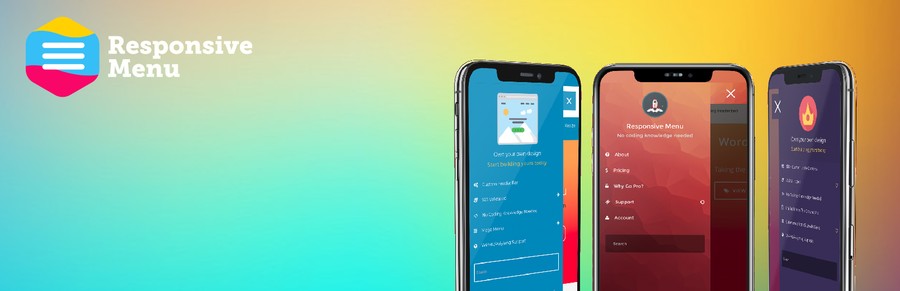
Highly customizable Responsive Menu Plugin for WordPress. With over 150 customizable options you get a combination of 22,500 options! No coding experience or knowledge is needed with an easy-to-use interface you can get it looking exactly as you want with minimal fuss.
WordPress Mega Menu – QuadMenu

QuadMenu is a WordPress Mega Menu that will allow you easily integrate the menu into your theme’s project. This plugin allows you to create mega menus, tabs menus, and carrousel menus in a simple and native way converting your existing menu into a powerful tool.
WP Responsive Menu
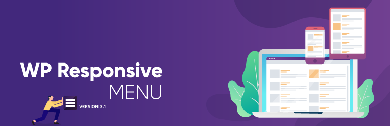
WP Responsive Menu is a simple plugin that lets you add a highly customizable responsive menu to any WordPress site in no time at all and customization can all be done directly from the setting page, with no coding needed at all.
WP Mobile Menu – The Mobile-Friendly Responsive Menu

WP Mobile Menu is the best WordPress responsive mobile menu. Provide to your mobile visitor an easy access to your site content using any device smartphone/tablet/desktop.
Max Mega Menu
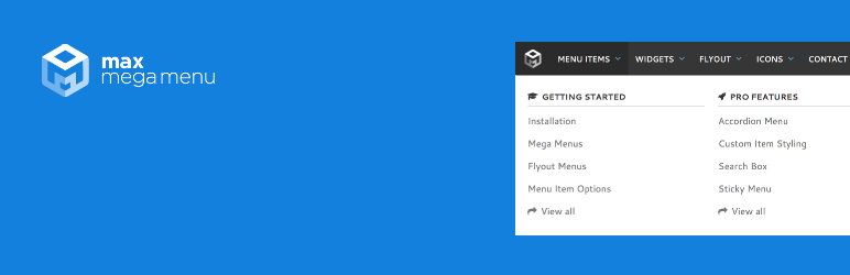
Max Mega Menu will automatically convert an existing menu into a mega menu. You can then add any WordPress widget to your menu, restyle your menu using the theme editor and change the menu behavior using the built-in settings. It is a complete menu management plugin, perfect for taking control of your existing menu and turning it into a user-friendly, accessible, and touch-ready menu with just a few clicks.
Not Comfortable with HTML and CSS? Build Hamburger Menu on Website Building Tool
If you are not comfortable with HTML and CSS, you can still create a hamburger menu on your website or app using a website-building tool. There are a number of tools available that can help you to create a hamburger menu without having to write any code.
These tools provide an easy way to create a hamburger menu, and all you need to do is drag and drop the elements to create the menu. You can also customize the menu to match the design of your website, and add functionality to make it responsive.
Hamburger Menu on an Android App
The hamburger menu can also be used on an Android app, and it is a great way to reduce clutter and improve the user experience. It can be used to hide the navigation menu and make it easier for users to access it with a single click.
When creating a hamburger menu for an Android app, it is important to make sure that it is easy to use and works on all devices. This means that the menu should be visible on both phones and tablets, and it should be easy to use on both devices.
In addition, it is also important to make sure that the menu is accessible to all users. This means that the menu should be easy to use for users with disabilities, and it should also be easy to find and use for users who are not familiar with it.
Hamburger Menu Example
The CodePen website is a unique way for front-end designers and developers to showcase their websites and their work. From this website, we developers can see examples of hamburger menus created by different developers. We can take ideas from these works and add them to our website.
Here are links to some great hamburger menu designs.
| Title of the Project | CodePen Link |
|---|---|
| Responsive dropdown menu w/ darkmode support (html, vanilla js, scss) by JP Branski | Link |
| Updated Microsoft Homepage Clone by Uzair Zafar | Link |
| Pure CSS Hamburger Menu by Tony G | Link |
| Hamburger menu with no JS by Anshuman Pandey | Link |
| Full-Screen Hamburger Menu by Fred Graybeal | Link |
| Hamburger menu 2 by Takashi Yamakawa | Link |
| FullScreen Hamburger Menu by Oguzhan | Link |
Create Your Hamburger Menu Today
The hamburger menu is one of the most widely used UI elements on mobile devices and desktop websites, and it can be a great way to reduce clutter and improve the user experience.
Creating a hamburger menu is relatively easy, and you can do it using HTML, CSS, and JavaScript. You can also create a hamburger menu on a WordPress website using a plugin, or you can use a website-building tool if you are not comfortable with HTML and CSS.
So why wait? Create your hamburger menu today and start improving the user experience of your website or app.
Conclusion
The hamburger menu is an alternative to the traditional top-level navigation bar and provides a more minimalistic interface that contains all of the same content. The hamburger menu saves space on mobile devices and reduces the number of clicks needed to navigate through an app.
At present this hamburger menu is used on almost all websites. However, variations of this menu can be observed based on the design and goals of each website.
If you are considering using this menu on your website, however, I hope that this post’s discussion, code samples, and references to other websites will provide you with some helpful input.
Leave Your Comment