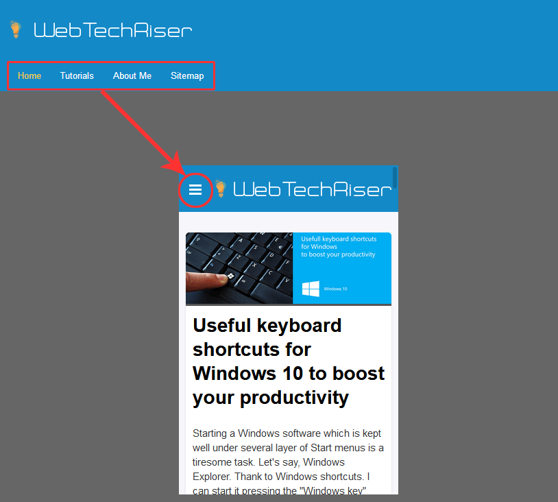
Any Content Management System (CMS), Joomla!, WordPress, Drupal, etc, however, is nowadays a web standard to build their themes or template, whatever you say, responsive for mobile devices. The horizontal long menu that we see in Desktop PC monitors shrinks to a 3-small-horizontal-bars in devices. Tap on it, and the menu opens up expanding downward or sideways.
As the menu script is written in Joomla! CMS using Bootstrap version 2.3.2, HTML “span” is used. To change the background color on :hover or :focus, writing span:hover, or, span:focus, and changing the “background-color” property will not change the color of that icon. Rather, we have to apply :hover, and/or, :focus effect on the parent element and change the background color of the “span” element as a child item.
The LESS file name for the responsive menu is named “navbar.less” and the corresponding CSS code is:
.navbar .btn-navbar .icon-bar {
    display: block;
    width: 18px;
    height: 2px;
    background-color: #fff;
    border-radius: 1px;
    box-shadow: 0 1px 0 rgba(0,0,0,.25);
}
As we can see, this “.icon-bar” is the class name of our “span”. So, I will write the CSS in the correct media query (for making it responsive) as below:
@media only screen
and (min-device-width : 320px)
and (max-device-width : 480px) {
    .navbar .btn-navbar:hover span,
    .navbar .btn-navbar:focus span {
        background-color: #73ccbb;
    }
}
I hope that this little piece of code will be useful.
Happy CSSing!
Leave Your Comment